It’s Not Always the Copy: When Technical Issues Quietly Kill Your Conversion Rate
When a page doesn’t convert, most people reach for copy:
- new headline
- new hero section
- new CTA microcopy
Sometimes that’s right.
But often the problem is simpler: visitors never go far enough to read your improvements.
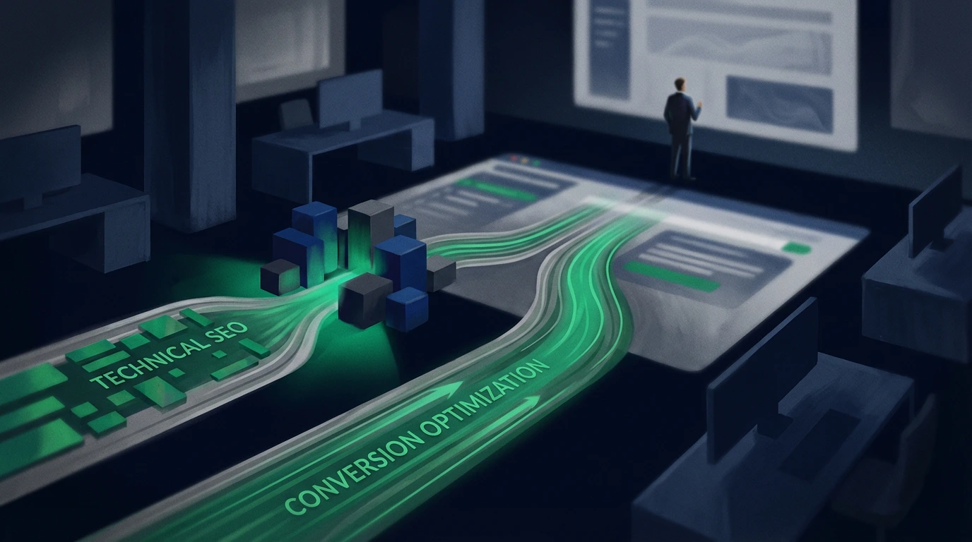
1. The two main bottlenecks
Every page with poor conversion usually falls into one of these categories:
-
Access bottleneck (technical/UX)
Visitors bounce before they see what matters. -
Decision bottleneck (messaging/proof)
Visitors see the offer but don’t trust it enough.
If you don’t know which one you’re dealing with, you’ll keep “improving copy” on a page that’s broken underneath.
2. Quick technical bottleneck checklist
Ask these questions before touching copy:
- First-visit load
- Does the page feel slow on 4G (or normal mobile networks)? - Layout shifts
- Do buttons and forms jump while the page loads? - Broken flows
- Can the form be submitted without weird errors?
- Does the “Book a Call” button really lead to scheduling (or the real thank-you)? - Mobile experience
- Can you see the CTA without zooming?
- Is the main message readable above the fold?
With Website Analyzer, you get a structured view of: - basic performance - mobile-friendliness issues - red flags for rendering or accessibility
If this fails, fix it before rewriting a single line of text.
3. Decision bottleneck checklist (messaging)
When the technical basics pass, focus on the message:
-
Clarity
- In 5 seconds, does someone who doesn’t know you understand what you do and who it’s for? -
Relevance
- Are you talking about their problem, or your internal jargon? -
Proof
- Do you have concrete results, testimonials, and measurable outcomes? -
Next step
- Is it clear what happens after they click “book / contact / request”?
Use Website Messaging Strategy as the reference: - problem → promise → proof → process → CTA
If those blocks are weak (or in the wrong order), you have a decision bottleneck.
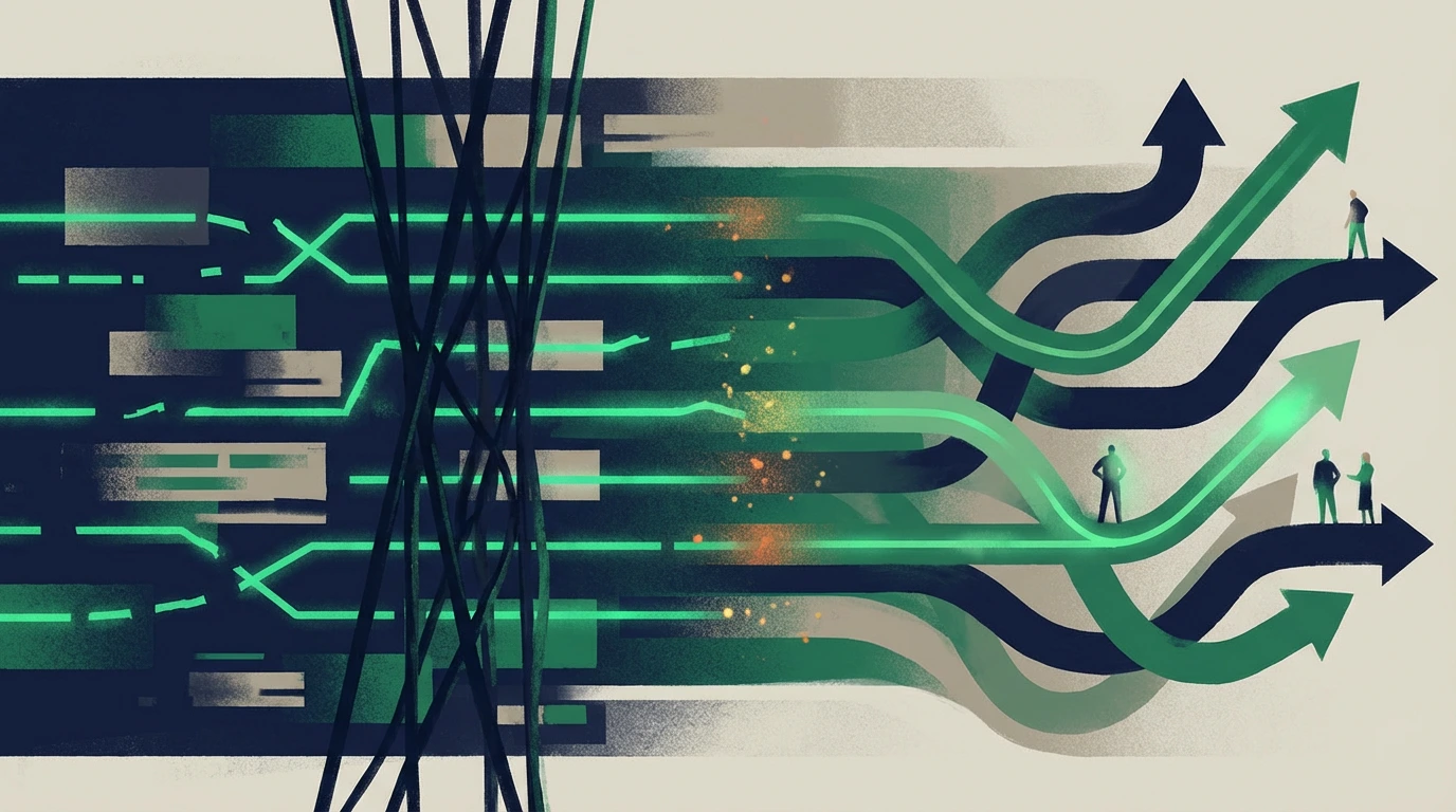
4. Decide where to start (copy vs tech)
Simple rule:
-
Very high bounce + very low time on page
→ suspect performance/UX first. -
Reasonable scroll, but few CTA clicks
→ suspect messaging + proof. -
CTA clicks, but few forms/calls completed
→ suspect friction in the form or lack of trust at that step.
To validate, combine:
- Website Analyzer → “are people likely seeing what matters?”
- AI SEO Analyzer → “does it sound like it actually answers their need?”
- Meta Analyzer → “are we attracting the right kind of user from search?”
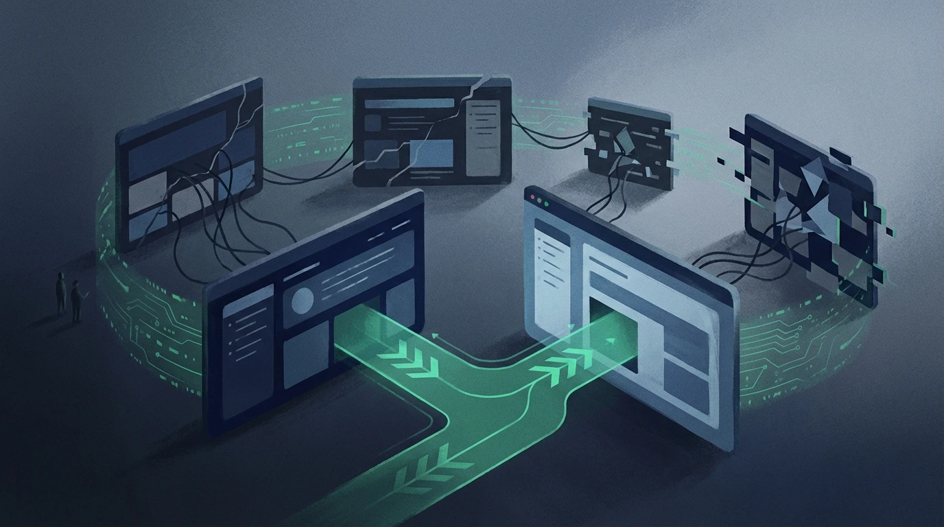
5. What to do next (time-saving sequence)
For any page with weak conversion:
If you’re not sure whether the bottleneck is technical access or messaging/proof, start with Technical SEO vs Conversion Bottleneck Test.
- Run Website Analyzer → fix anything that’s clearly broken.
- Re-check title/meta alignment with Meta Analyzer.
- If performance is still poor: - adjust the title + the first screen - move/strengthen proof near the CTA - simplify the conversion path (fewer steps, clear lead outcomes)
If your bottleneck concentrates around the final CTA step, use Your “Book a Call” Button Isn’t the Problem: Here’s What’s Actually Killing Conversions.
Only after that, consider bigger layout experiments.
Strong takeaway
Copy matters, a lot.
But if the page is technically fragile, better words won’t rescue it.
Treat performance, UX, and reliability as conversion prerequisites.
Once those are solid, your messaging work can finally turn attention into real leads—not just prettier text.
If you’re still seeing “we improved copy, but nothing changed,” use 5 Website Conversion Mistakes That Kill Leads to avoid repeating the same pattern. And if your symptom is traffic but no inquiries, start the diagnosis with Why Your Website Isn’t Generating Leads (And How to Fix It).
Finally, connect improvements to revenue by tracking whether outcomes improved with Measuring Website ROI: How to Prove Your Site Creates Value, and keep each key page focused on one lead outcome using One Page, One Outcome: Design for Leads, Not Sessions.